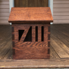
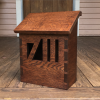
Dovetailed Mailbox in Oak (with Red Mahogany stain)

Status
Not open for further replies.

DTBoss

New User
Dan
Quartersawn oak mailbox for a neighbor. Had to hand chisel the numbers out. Should I have defined them more with a line etched around them, or do you like them how they are? Takes a second look for some to see the numbers, which I kind of like, actually.

Battled hidden glue residue mucking up my first attempt at staining, but after the pic was taken I sanded the whole front bare to get rid of it on the second go 'round!

-Dan

attachment.php
attachment.php
 

Attachments

  • Screen Shot 2017-07-11 at 10.24.50 PM.png
    Screen Shot 2017-07-11 at 10.24.50 PM.png
    1.9 MB · Views: 268
  • Screen Shot 2017-07-11 at 10.25.57 PM.png
    Screen Shot 2017-07-11 at 10.25.57 PM.png
    2 MB · Views: 264

Jim M.

Woody
Corporate Member
Nice project Dan, I like the numbers, but understand wanting to define them more.
 

Raymond

Raymond
Staff member
Corporate Member
I like the design and I think that an inlaid brass wire outlining the tops and bottoms of the numbers would be striking.
 

DTBoss

New User
Dan
ohhh. wow. That would be cool! Might venture that way on the next one, as long as someone doesn't live at 713594 1/2. :)
 

faber

New User
faber
Two suggestions (from a graphic designer / typography nerd turned woodworker). These are a little hard to explain so I just whipped up a little photoshop demonstration.

- Quick fix - notch out a little big of the top crosspart of the 7.
attachment.php


- Slightly more in-depth fix - notch out a full-height area on both the left and the right.

attachment.php


Both of these accomplish the same kind of thing. The main reason it's hard to read as a 7 is that you're using the left side of your bounding area (cutout) and making the viewer imply the edge of the top of the 7. By defining that left side, it's much faster and easier to read as a 7. This actually is true of all reading in general. The top half of letterforms are much more recognizable and unique than the bottom half, and when you read quickly, you unconsciously flow over the top half of words without necessarily "mentally consuming" the entire letter form. To prove it, just take any sentence here, hold a piece of white paper over the bottom half of the words - you should still be able to read it quite easily. Do the same thing and hold the paper over the top half of the letters and it's way harder.

As for the two different options above - The first one is easy and would be relatively small work, however it makes the 7 look a little bit off-balance to my eye, like it's going to fall over to the right with it's stubby crossbar at the top. By just opening up a bit more of the left of the entire 7, you get the full crossbar and the benefit of the more defined number, however it would be unbalanced as a whole, so opening up an equal amount on the right side of the 1 would balance it a bit more.

Edit: that said, I initially didn't even notice the 711, and thought it was a cool modern looking cutout for pure aesthetic purposes, which I liked. It then becomes a "bonus" to realize that it's the numbers. So maybe don't change anything if that's more what you're going for. The above rec's are mainly just to increase readability of the numbers, not necessarily "better".
 

Attachments

  • Screenshot 2017-07-12 15.58.32.png
    Screenshot 2017-07-12 15.58.32.png
    2.1 MB · Views: 194
  • Screenshot 2017-07-12 15.59.12.png
    Screenshot 2017-07-12 15.59.12.png
    2.1 MB · Views: 193

DTBoss

New User
Dan
Thanks for the typography-nerd insight!
I particularly like the top one you did, whereby I just express the upper-left of the 7. It is clearer while still showing it to be from a single piece of wood. If I do another one like this, I'll keep that in mind. As for seeing the numbers as 711, it's sort of like the arrow hidden in the FedEx logo. Once you see it, you can't un-see it!
 

faber

New User
faber
Thanks for the typography-nerd insight!
it's sort of like the arrow hidden in the FedEx logo. Once you see it, you can't un-see it!

Really hoping someone on here hasn't seen that arrow and gets their mind blown today.
 

JohnW

New User
John
Arrow??? What arrow? BAM...POP...#*@%$#...FIZZZLE (sound of mind blowing up):tinysmile_tongue_t:
 

tri4sale

Daniel
Corporate Member
It's a great design, except for the numbers. As someone whose job requires reading house numbers multiple times a day, I would curse this one. It really is just too hard to read the numbers, especially when the mailbox is setback from the road and you're trying to read it and figure it out from 20+ feet away. It took me forever to figure out the address was 711, at first I thought it was just an artistic design. It just shouldn't take a second look to id house numbers.
 

DTBoss

New User
Dan
It's a great design, except for the numbers. As someone whose job requires reading house numbers multiple times a day, I would curse this one. It really is just too hard to read the numbers, especially when the mailbox is setback from the road and you're trying to read it and figure it out from 20+ feet away. It took me forever to figure out the address was 711, at first I thought it was just an artistic design. It just shouldn't take a second look to id house numbers.
Thank you. Thankfully, these aren't the only numbers used to identify the house address. They have a set stenciled on their door a few feet away. A good thing to remember though should this idea be used again!
 

nn4jw

New User
Jim
I couldn't really make out the numbers for sure until the last picture where the right side blank space was widened out to a more balanced size. Much easier to see unambiguously in that pic.
 
Status
Not open for further replies.

Premier Sponsor

Our Sponsors

Top